
More than half of all web traffic is on phones — your site has to look great on every one.
Knowing how to make website mobile friendly is no longer optional. Over half of all visitors now browse on their phones, and Google ranks your site based on its mobile version first. If your site is hard to use on a small screen, you lose both visitors and rankings.
The good news: making a website mobile-friendly comes down to eight clear steps. Work through them in order and your site will look sharp and load fast on any device.
Why mobile-friendliness matters
Google uses mobile-first indexing — it looks at your site’s mobile version to decide how you rank, even for desktop searches. On top of that, most people simply leave a site that’s clumsy to use on a phone. A mobile-friendly site keeps more visitors, converts more of them, and ranks higher. It’s one of the highest-impact things you can do for both users and SEO.
How to make website mobile friendly, step by step
Here are the eight steps, from the most important to the finishing touches.
1.Use a responsive design
A responsive design automatically adjusts your layout to fit any screen — phone, tablet, or desktop. This is the foundation of a mobile-friendly site.
How: Use a responsive theme (most modern WordPress themes are) and check that every section reflows neatly on a narrow screen. Avoid fixed pixel widths.
2.Make your text readable without zooming
Tiny text forces visitors to pinch and zoom — a fast way to lose them. Mobile text needs to be comfortable to read at a glance.
How: Keep body text at least 16px, use good line spacing, and make sure paragraphs aren’t squeezed edge to edge on small screens.
3.Use large, tap-friendly buttons
Fingers are less precise than a mouse. Buttons and links that are too small or too close together lead to mis-taps and frustration.
How: Make tap targets at least around 44px tall, add space between links, and keep your main call-to-action button big and easy to hit.
4.Compress and optimize your images
Phones often run on slower mobile data. Heavy images make your site crawl — and slow sites lose mobile visitors fast.
How: Resize images to the size they display, compress them, and use modern formats like WebP. (A slow site has other causes too — see our guide on why your website is so slow.)
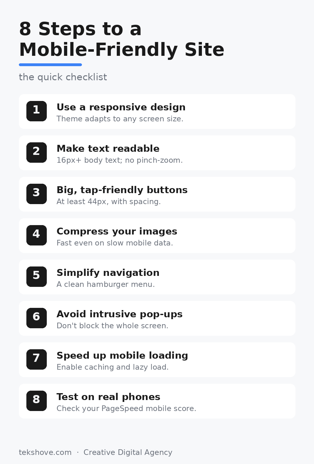
Save or share this checklist — all eight steps at a glance.
5.Simplify your navigation
A big desktop menu doesn’t fit a phone screen. Cramped menus are hard to use and clutter the view.
How: Collapse your menu into a clean “hamburger” icon on mobile, and keep the number of top-level links short and clear.
6.Avoid intrusive pop-ups
A pop-up that covers the whole phone screen annoys visitors — and Google can penalize pages that use them aggressively on mobile.
How: If you use pop-ups, make them small, easy to close, and never let them block your main content on mobile.
7.Speed up mobile loading
Mobile users are the least patient. If a page takes more than a few seconds on a phone, most people leave before it appears.
How: Enable caching, turn on lazy loading for images, and cut heavy scripts. Aim for a load time under two seconds on mobile.
8.Test on real phones
Your site can look fine on your laptop and still be broken on a phone. Always check the real thing.
How: Open your site on a few different phones, and run it through the free Google PageSpeed Insights tool, which grades your mobile experience and lists exactly what to fix.
Frequently asked questions
How do I know if my website is mobile-friendly?
Open it on a phone and check if you can read and tap everything without zooming. Google PageSpeed Insights also gives you a mobile score and specific issues to fix.
Does mobile-friendliness affect SEO?
Yes. Google uses mobile-first indexing, so your mobile version directly affects your rankings — even for desktop searches.
Is a responsive website the same as a mobile-friendly one?
Responsive design is the main way to make a site mobile-friendly, but you also need readable text, tap-friendly buttons, and fast loading to get it fully right.
Do I need a separate mobile website?
No. A single responsive website that adapts to every screen is the modern, recommended approach — easier to manage and better for SEO.
Want a site that looks perfect on every phone?
TekShove designs fast, fully responsive websites — and can fix an existing site that doesn’t work well on mobile. Let’s make your site mobile-friendly and ready to rank.
Talk to Our Team
Tell us what you need help with and our team will get back to you.